Hello, we are “ZAP-Hosting”.

We are “ZAP-Hosting”.

ZAP-Hosting is the world’s fastest growing game server & virtual server provider. We facilitate and help make games into awesome memorable experiences. Ever since 2010 we offer an wide range of powerful server products and our experience. Host your own server in 60 seconds on one of our many different locations across the globe. We have the best network infrastructures, offer the best DDoS protection and highly available server performance.

As we made some adjustments to our vision to meet the constantly changing needs of our users, our brand has also evolved. ZAP-Hosting has a new brand identity and design system. This is where we educate you about our brand and where you get crystal clear instructions on how to safely design with/for our brand.

Logo versions

Light backgrounds

Our brand standard logo/brand icon/mark must always be printed in our defined brand colors as described in the color system section. For white backgrounds always use a logo having dark color typography.

Dark backgrounds

If the brand logo need to be printed or displayed in dark color background, the logo having light typography will be used. Dark black or, other dark colors are the preferred background color for this version of logo.

Logo variations

Full logo

Logo icon

Logo wordmark

Logo sizes

Minimum size (digital)

For digital usage, such as on websites or social media platforms, the minimum size of a logo is typically defined in terms of pixel dimensions. The specific minimum size can vary depending on the design, but a common recommendation is to have a logo size of at least 60 pixels in width. This ensures that the logo remains recognizable and doesn’t lose its visual impact when displayed on screens of various sizes.

Horizontal Logo: 60 pixels/ 0.83 inch
Logo Icon: 40 pixels/ 0.55 inch

Website logo sizes

In general website logos can be any size, however the recommended logo dimensions for a web page are 250 x 150 pixels. Remember that our logo will not take up the entire width of a website, banner or layout, Rather it should be included in the overall design.
Some standard measurement for website are given below:

Favicon:

16 x 16 pixels

32 x 32 pixels

48 x 48 pixels

Vertical Logo:
160 x 160 pixels

Horizontal Logo:
250 x 150 pixels
350 x 75 pixels
400 x 100 pixels

Social media sizes

Instagram
Profile Photo (circular) 110 x 110 pixels

X (formerly Twitter)
Profile Photo (circular) 400 x 400 pixels
Cover Photo 1500 x 500 pixels

Facebook
Profile Photo (square) 170 x 170 pixels
Cover Photo 820 x 312 pixels

LinkedIn
Profile Photo (circular) 160 x 160 pixels
Cover Photo 1198 x 191 pixels

YouTube
Profile Photo (circular) 800 x 800 pixels
Cover Photo 2560 x 1140 pixels
Thumbnail Photo 1280 x 720 pixels

Logo safe usage

DO NOT: Outline

Do not outline our logo.

DO NOT: Distort

Do not distort or reshape our logo.

DO NOT: Fonts

Do not use any other font, no matter how close it might look to our selected font.

DO NOT: Sizing

Do not squish or squash our logo. Any resizing must be in proportion.

DO NOT: Effects

Do not apply effects like shadow, emboss, blur, gradients, etc.

DO NOT: Color

Do not change the colors, no matter how close it might look to our official colors

DO NOT: Old Logo

Do not use any logo version NOT provided by this website.

Our fonts

Our primary font should be the default typeface, a reflection of the overall brand identity. We have defined a method below that provided guidance on “when / where to use our primary font & secondary font”.

Primary Font: Poppins

Ab

Ab

A B C D E F G H I J K L M N O P Q R S T U V W X Y Z
a b c d e f g h i j k l m n o p q r s t u v u x y z
1 2 3 4 5 6 7 8 9 10 ! ?

A B C D E F G H I J K L M N O P Q R S T U V W X Y Z
a b c d e f g h i j k l m n o p q r s t u v u x y z
1 2 3 4 5 6 7 8 9 10 ! ?

LIGHT

BOLD

ITALIC

SEMIBOLD

REGULAR

BOLDITALIC

MEDIUM

EXTRABOLD

Secondary Font: Nexa

Ab

Ab

A B C D E F G H I J K L M N O P Q R S T U V W X Y Z
a b c d e f g h i j k l m n o p q r s t u v u x y z
1 2 3 4 5 6 7 8 9 10 ! ?

A B C D E F G H I J K L M N O P Q R S T U V W X Y Z
a b c d e f g h i j k l m n o p q r s t u v u x y z
1 2 3 4 5 6 7 8 9 10 ! ?

EXTRALIGHT

HEAVY

LIGHT

REGULAR

BOLD

Font usage

Leading

Leading is the space between multiple lines of type, which can be as few as two lines of type to well, as many lines as needed.

Tracking

Tracking is the process of loosening or tightening a block of text.

Headline/Title

We use the following font for all Headlines/Titles:

Nexa Heavy

Leading: Auto
Tracking: 0 points

Sub-Headline

We use the following font for all Sub-Headlines:

Poppins Semibold

Leading: Auto
Tracking: 0 points

Body copy

We use the following font for all Body Copy:
Poppins Regular
Leading: Auto
Tracking: 10 points

Color usage

  1. Don’t put light text on a light background.
  2. Don’t change the official logo color.
  3. Don’t use busy backgrounds.
  4. Use the appropriate color proportions.
  5. Don’t replace colors with a texture.
  6. Don’t place similar colors on one another.

Color modes

Primary colors:

Primary colors are the core colors that form the foundation of our visual identity. They are typically used for our logo, main typography, and key brand elements. Our primary colors help establish brand recognition and consistency.

Why So Blue?

#1B1434
(RGB) 27, 20, 52
(CMYK) 48, 62, 0, 80

Zappy

#18e888
(RGB) 24, 232, 136
(CMYK) 90, 0, 41, 9

White

#ffffff
(RGB) 255, 255, 255
(CMYK) 0, 0, 0, 0

Secondary colors:

Secondary colors are additional colors that complement our primary colors and expand our color palette. They are often used to add variety and visual interest to marketing materials, website design, and other brand assets.

Caribbean Green

#00c48b
(RGB) 0, 196, 139
(CMYK) 100, 0, 29, 23

Turquoise

#39f1b3
(RGB) 57, 241, 179
(CMYK) 76, 0, 26, 5

Aqua

#00ffff
(RGB) 0, 255, 255
(CMYK) 100, 0, 0, 0

Black

#000000
(RGB) 0, 0, 0
(CMYK) 0, 0, 0, 100

Gradient

Secondary colors are additional colors that complement our primary colors and expand our color palette. They are often used to add variety and visual interest to marketing materials, website design, and other brand assets.

#18E888

(RGB) 24, 232, 136
(CMYK) 90, 0, 41, 9

#18E888

(RGB) 24, 232, 136
(CMYK) 90, 0, 41, 9

Linear Gradient
0 Angle
#00ffff

(RGB) 0, 255, 255
(CMYK) 100, 0, 0, 0

#00FFFF

(RGB) 0, 255, 255
(CMYK) 100, 0, 0, 0

RGB

(Red, Green, Blue) color mode is for anything that is computer-based design. This includes websites, apps, banner ad and any other design created for electronic use.

CMYK

(Cyan, Magenta, Yellow, Black) color mode is used for print design. This includes logos, business cards, stationary, illustration, packaging and any other designs used for print.

Business cards

The general size of business card is 8,89 x 5,08 cm (3.5 x 2 inches) with an extra bleed of 0,3 cm (0.125 inch) for printing purposes.

Letterhead

The general size of a letterhead is 20,82 x 29,46 cm (8.2 x 11.6 inches) with an extra bleed of 0,3 cm (0.125 inch) for printing purposes.

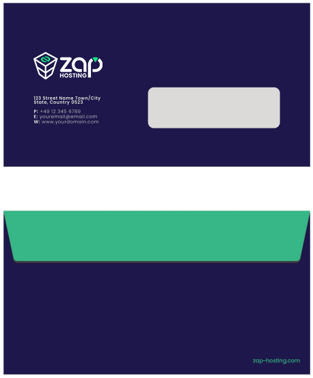
Envelope

Email signature

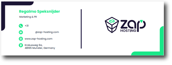
The general size of a email signature is 210 x 70 pixels.

Partner lockups